YES, I KNOW THAT’S NOT WHAT A REAL TSUNAMI LOOKS LIKE
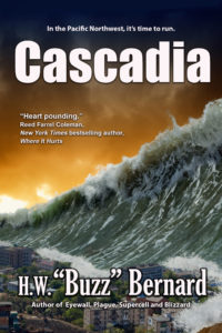 When I got my first look at what is now the cover of Cascadia, my left-brain (logical, factual) persona took over.
I fired off an email to my publisher: “NO, sorry. The cover image looks great, but it’s much too Hollywood. A real tsunami doesn’t look anything like that.”
Now most publishers, especially the majors, will merely drop a cover in an author’s lap and say, “That’s it.” But in an unusual effort to accommodate their left-brained, pain-in-the-ass novelist, me, Bell Bridge Books ran through five more iterations of the cover.
We tried more subdued images, images using the Seattle skyline, the Portland skyline, maps, tsunami evacuation signs, and on and on. None of them carried the impact of what you see now.
Finally, and understandably, my publisher got a bit PO’d with me and told me, in so many words, fish or cut bait.
The argument the president of the company, Debra Dixon, mounted in favor of the initial version of the cover made a lot of sense. (I guess I’m not totally left-brained.) She said, “Version 1 has been the most dramatic by far. The goal is to catch the attention of all readers, not just those in the Northwest. Cover #1 has my vote as one that works well for both brand and genre. And to convey the general subject matter quickly, clearly and with drama. We aren’t looking for literal. We’re looking for intriguing.”
I agree. (Yay, let’s hear it for my right brain.) Maybe a few people will be put off by “The Wave That Ate Oregon,” but for most it should be a grabber.